HOSTEL - Part2
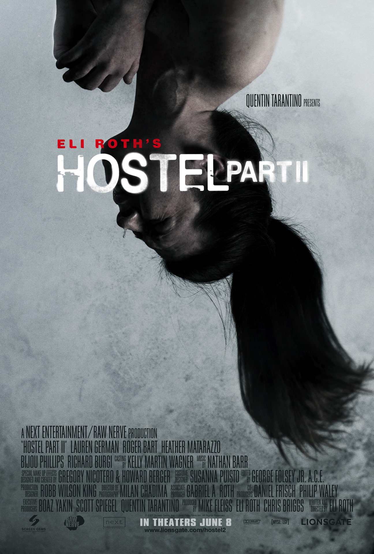
The target audience for the 'Hostel' poster is males aged between 12-25 because it falls under the horror genre. The theorist who would most likely be reinforced here would be Stanley Hall with his 'Storm
and Stress Model' (1904) who stated: “Youth aged between 12 an 24 are involved with crime, mood depression and sex.” I will be analysing the the poster to see if it follows the common conventions of the horror genre.
Image
The poster follows the common conventions in terms of the image that has been used. Usually in horror genres the poster usually only have one select image to attract the audience and clearly represent the narrative. Blumer and
Katz theory of entertainment and diversion can be reinforced here has the audience will seem very curious and interested in the meaning behind the image. It seems to be a young woman bounded up and hanging from her feet. She seems very distressed as if shes the victim, this will entice the audience to find out the narrative of 'Hostel part2'. Also Laura Mulvey's theory that woman are seen as 'objects of sexual desire' as she appears to be naked and this would appeal to a male target audience more so than a female.
Typography
In terms of typography the poster follows the common conventions as the release date is present and the production companies that help distribute the film are involved too. At the bottom of the poster the text isnt very clear for the audience to read, however if they were up close to the poster. Although this text isnt very important but is something required on posters as conventions to show the audience if they wanted to see who was involved in the production of the film. Although due to the minimalistic typography it makes the poster very simplistic which will appeal to the target audience so it doesnt need to much text.
Colours
The colours involved with the poster are very saturated like the vibrancy has gone and to me this symbolises that the life has been drained from the image which gives it that eerie look of danger and potential fear. The colours are greys and saturated light blues as these colours represent negativity which connotes that something bad is bound to happen in the film. These colours represent the horror genre very well, although conventional colours for horros are reds and black which this poster doesn't include. However these colours are still conventional as it is clearly representing the horror genre.
Layout
The layout of the poster is different from other horror posters I have analysed as the text goes up the poster rather than sticking to the middle bottom of the poster. However this effect works very well and even though it isnt entirely conventional. The only thing this poster is missing is the tag line as most poster of all genres include this important convention as it entices the audience.
DRAG ME TO HELL
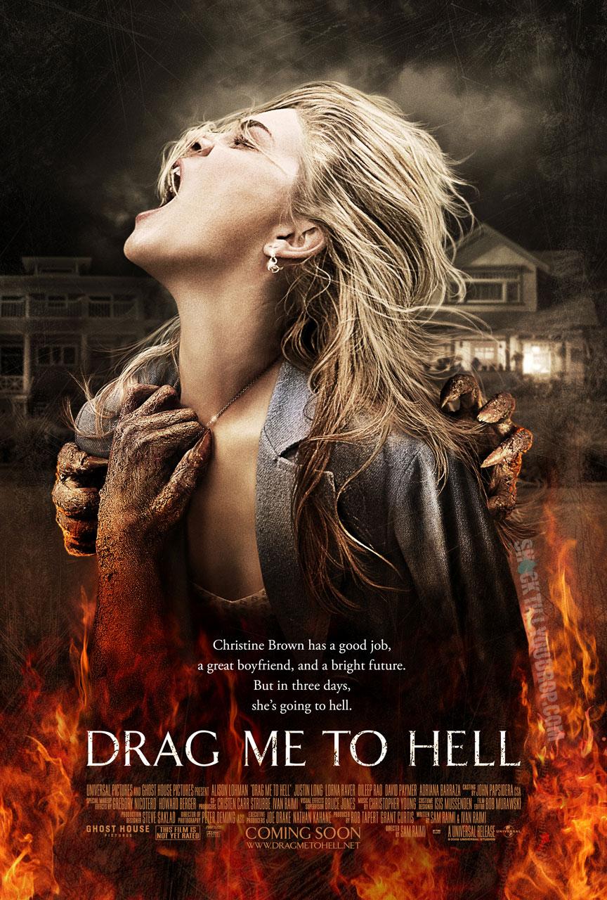 The target audience again is males aged from 12-25 because it is a horror genre. Although this could also appeal to a female target audience because of the use of colours and features in the poster.
Image
The poster again follows the common conventions that apply with images. Blumer and Katz theory of entertainment and diversioncan be applied here as the target audience will be curious and interested in why 'she' is going to hell. The image follows the conventions by using just the one image and in the image she is screaming as she is being dragged to 'Hell' by an unknown creature that is left to the imagination. Laura Mulvey could potentially be applied here with her theory of the 'male gaze' as the star vehicle in the image is a visually attractive woman and would attract a male audience more than a female.
Typography & Lexis
To create a reaction from the audience who views the poster, the creators have used "Christine Brown has a good job, a great boyfriend and a bright furture. But in three days, she going to hell." This begins very positivly and then quickly turns negative which will entice and interest the audience as the viewer will want to know why this is happening. Blumer and Katz theory can apply here again as the audience can see by the poster saying 'coming soon' allows the audience to see that the film will be out within that time period.
Colours
The colours used are fairly conventional as the red/orange fire is a typical convention of horror poster, this colour also helps connote anger and danger. These colour represent horror very well and are very common colours used within this genre. This iconography can help create tension from the audience as it could be reflecting emotions towards the target audience.
Different selection of horror poster-
These posters all show the common conventions used in horror posters, however it shows how they can all be different yet follow the majority of these conventions.


Layout
The layout of the poster is different from other horror posters I have analysed as the text goes up the poster rather than sticking to the middle bottom of the poster. However this effect works very well and even though it isnt entirely conventional. The only thing this poster is missing is the tag line as most poster of all genres include this important convention as it entices the audience.
DRAG ME TO HELL
Image
The poster again follows the common conventions that apply with images. Blumer and Katz theory of entertainment and diversioncan be applied here as the target audience will be curious and interested in why 'she' is going to hell. The image follows the conventions by using just the one image and in the image she is screaming as she is being dragged to 'Hell' by an unknown creature that is left to the imagination. Laura Mulvey could potentially be applied here with her theory of the 'male gaze' as the star vehicle in the image is a visually attractive woman and would attract a male audience more than a female.
Typography & Lexis
To create a reaction from the audience who views the poster, the creators have used "Christine Brown has a good job, a great boyfriend and a bright furture. But in three days, she going to hell." This begins very positivly and then quickly turns negative which will entice and interest the audience as the viewer will want to know why this is happening. Blumer and Katz theory can apply here again as the audience can see by the poster saying 'coming soon' allows the audience to see that the film will be out within that time period.
Colours
The colours used are fairly conventional as the red/orange fire is a typical convention of horror poster, this colour also helps connote anger and danger. These colour represent horror very well and are very common colours used within this genre. This iconography can help create tension from the audience as it could be reflecting emotions towards the target audience.
Different selection of horror poster-
These posters all show the common conventions used in horror posters, however it shows how they can all be different yet follow the majority of these conventions.