http://www.youtube.com/watch?v=VmbRLglgN2A
Friday, 3 May 2013
Evaluation
Here is the Youtube link to my evaluation regarding my A2 media productions. This includes 4 key questions which are answered in my evaluation.
http://www.youtube.com/watch?v=VmbRLglgN2A
http://www.youtube.com/watch?v=VmbRLglgN2A
Finished trailer & production
This is the link to the finished trailer for 'The Dark Room'.
Here are some of the screenshots of the production process of creating our horror trailer.

In this shot you can see how we have incorporated a green-screen to show our audience if the trailer/film is aged restricted. However we chose to take this feature out because it is an American feature that you see in films distributed by an American conglomerate. We are creating a British film and didn't want to incorporate this feature as we have already involved the 'Paramount Pictures' logo as this is the company we want to distribute our film.

This next section shows the production logo which again we have changed as it doesn't work with the theme of the trailer. Also it was too long, by the time we had seen both logos it was almost 30 seconds of the trailer gone so we had to delete this section and spread every thing out so the audience doesn't get bored of watching productions logo for the first part of the trailer.

This is a shot of the near middle part of the trailer, this is of the killer and shows how he overpowers the woman which follows the typical common conventions of horror movies. This also shows in the left corner the production of the trailer and how we cut each individual section to make sure it was fully effective and was useful in the trailer. Each section plays its part.

The next two images show how we edited the sound control and colour correction. With the sound we needed to use a temporary song track while we constructed sounds and music in GarageBand on the Macs. The song "Bring me to life by - Evanescene" and this provided a basis for our trailer. We couldn't use this track anyway due to copyright laws as we don't have permission to use the song and this would cause problems if we were to use it anyway.

With the colour correction, the original colour was too light and needed to be darkened and changed. When doing this we changed quite a lot of things and we also sped up the cars to make it seem like they were moving quicker because the effect was really good and we needed also to shorten the clip too.

This last screenshot shows the sound correction being changed and what we have done to it by the bar on the left side. We tried to use as much footage as possible to make it look as effective and conventional as possible.
Audience Research
Here is a Prezi showing the results to the audience research surveys that I have done. I have combined 2 surveys before and after the creation of the products (ancillary texts). The surveys show both positive and negative feedback from my target audience which has proved to be very helpful.
Critical reflection of film poster

The image appeals to a male and female target audience and theorist Laura Mulvey one stated that women are seen as 'objects of sexual desire', I made sure the woman was visually attractive to appeal to a male audience and as she is wearing a corset and minimal clothing. This would also appeal to a female target audience because of the design and the fact that the star vehicle is a woman.
Additional features such as the social networking symbols and the paramount logo could have been better a little bigger because it is quite hard to make out what it is. Also the website for the film could of been cleared too because it could help with the promotion of the film. If I had the chance to do this again I would slightly change the the colour and sizing of the text.
Another thing I also picked up on was the fact that she is located in the woods and the title on the poster is 'The Dark Room' this could potentially confuse or make audience wonder why she is in the woods when the film is called 'The Dark Room'. However it is more symbolic, as she has opened a box full of old keys and the keys are the key to the 'Dark Room', she holds the keys that hold the secrets and this would be revealed in the film/trailer. This is why I have included 'The key to all the secrets' as the tagline to entice the target audience.
Critical reflection of film magazine

Here is my final magazine
cover that is distributing 'The Dark Room' to my target audience. It is
distributing many different films but the headline, major film is 'The Dark
Room'. I think that my magazine cover looks really effective and does the job
it is suppose to do. Although I think it could be improved as when I was
analysing other magazine film covers, for example, Inception, the design in the
background was really effective and really said something about the film. It
looked very technical which represented what the film was like which I though
was really effective. I think the colour balance could be improved as well as
the background. Although I think it portrays what the film is about and
represents that it is a horror genre. When creating my SurveyMonkey I asked the
target audience what would appeal to them on a magazine and I also asked them
particular features, colours and images they would prefer to see. Occasionally
I had to go against my target audience because not everything they wanted went
with the design of the cover. I took into consideration everything the target
audience wanted and applied as much as I could to the cover.
As the genre was horror the
magazine had to represent this. I did this through the colours and images.
Although the typography could have been better in terms of representation of
horror. I think the masthead is very effective and the title of the film, however
the block white doesn't look as effective as it could of done. Although the
magazine was not just representing horror, it was distributing other genres.
Because of this I think the cover can get away with the text and typography
design as it is not just horror that it is portraying. Many other magazines
don't feature very much text on the covers, this held me back a little as I was
stuck on what to include on the magazine cover. I analysed some magazines with
lots of text and some without. I chose to go in between as my target audience
mentioned what they wanted to see on the cover and it wasn't minimalistic text
they wanted to see but a range of different pieces of information, instead of a
mass amount that could potentially clash the magazine. If I were to do this
again I would definitely make sure I changed the colour and style of the main
text, by making it stand out differently and in a different font.
Usually magazine covers
feature only one star vehicle that is the main character in the film that is
being distributed. Although I have potentially broken this convention as I have
seen magazines that have more than one person on the cover. I thought this
would be really effective on the cover as it shows what the film is about and
how interesting it look, that it makes the audience intrigued and want to know
more. I’m not fully satisfied with the image so if I had the chance to do the
cover again I would change quite a few things. One of which would be the
'stamp' in the bottom left of the cover. It has too much text and doesn't seem
to fit in right with the whole horror concept. The idea of the stamp is really
good but I would have preferred to have had a faded image in the background of
the stamp or patterns.
I had problems with the
masthead before as it became merged to the image and when I wanted to make it
bigger the image increased in size too. This resulted in creating a new one and
re-doing the main image. When the masthead was completed and on the cover I
needed to increase its size but this made it look wrong and a little pixilated.
This resulted in me having the masthead a little smaller that originally
though. Although I do think it takes up 1/8th of the page which is very
conventional. After doing this the masthead and main image looked really good
together and after that I just added additional features and tried to make them
fit in as well as possible. Overall if I had the chance to do things
differently I would, although I don't think I have done a bad job.
Completed Magazine Cover

This is the finished version of my film magazine. After many attempts of trying to get the colour correction right I now finally have the finished product. This took many steps to create. For the text I used an online site called UrbanFonts to get the best looking fonts for my magazine. I didn't want to use too many different fonts as the cover would then clash and look too busy, as it is quite busy now. I took the all the images myself and two of them are studio images and the other two are off site photoshoots. I really like the top bar which shows different images to highlight the different films that are out soon for the audience to see. I know how to use Photoshop quite well so cropping, editing and adding effects didn't take too long as I knew how to previously do those kinds of features. I then added the barcode, price and issue number on to follow conventions. I added additional features to the cover as I had quite a lot of empty space which needed to be filled. After all these were completed I had my finished magazine film cover. Which was produced to what my target audience wanted, by my SurveyMonkey results.


Friday, 26 April 2013
Original images
I have done many photoshoots for this project and have used many different images. I have created a few mock ideas and used the same images a few times and other that are completely different. Here are some of original images that I have used to create my poster and magazine cover.


Both of these images were used in the magazine cover and poster. However I could not use two images that were similar to each other because it would not look very effective. I have edited these images quite a lot because these original images look a little saturated so I used Photoshop to make the images look harsh and more like the horror genre.

This is the original image used for my final image for the horror/psycological thriller film poster. This was taken in the woods near Lanhydrock and it is to symbolise hidden secrets by using a small box filled with old rusted keys.

Finished Poster & Flat Plans
Recently I have changed my mind on what the main image for the poster should be. I have changed the image completely and from creating a few different posters I have now created the poster that links into the genre and style of the trailer. Here is the finished poster for my project.


After creating many mock ideas of what the poster could look like. This is finally the completed poster.

Here is the process in which it took to complete my poster. Firstly I started with a blank canvas before I had the image. The once I had chosen the right image for the poster I used this and applied any additional touches to it e.g. changing the level and increasing the vibrancy. Once the colour balance looked just right I added the title of the film 'The Dark Room' and made sure it was located in the right place. Once that was finished I added additional features including the film crew that were involved, the website, release date, age rating of the film and production company logo to make sure the audience are briefly aware of who is also distributing the film. When this was completed I then added a quick and snappy tag line to interest the audience and make sure this helps to make them want to see the film if they don't already.
Monday, 15 April 2013
Todorov
Tzvetan Todorov simplified the idea of narrative theory whilst also allowing a more complex interpretation of film texts with his theory of Equilibrium and Disequilibrium. Todorovs narrative theory is widely used in movies and trailers, it is used in many different genres too. Some are not followed exactly to the point, however his theory is reinfored by many movies and movie makers. Todorov stated that there had to be:
- A state of equilibrium at the outset
- A disruption of the equilibrium by something
- A recognition that there has been a disruption
- An attempt to repair the disruption
- A reinstatement of the equilibrium
This narrative structure is very familiar to use especially in 'mainstream' films. This is followed by many conventional films and is shown throughout the narrative of the film. With psychological thrillers and horror movies there is always they key stages that have been addressed. In my trailer, there is only the first 3 stages that have been shown as this keeps the audience wanting to see more and this way we are not revealing the whole story to the audience. This builds suspense and makes the audience more inclined to watch the film. Overall in my trailer I have addressed and followed all these conventions that Todorov has suggested and by doing this we are producting typically a conventional film.


Friday, 12 April 2013
Budget
During the process of this project the budget has been very important for the production of my trailer and additional products. Firstly the main piece of equipment that was needed was a camera, for the project I used a Canon DSLR 600d which would usually cost roughly £769.00. Whereas on Amazon you can grab this camera for a cheaper price of £439.00 which is a bargin and saves money. The next most important piece of equipment was the Apple Mac used to construct the trailer, magazine cover and poster. In the market today this costs just over £1000.00. Already this creates a huge spend out of the budget. The next part is the software on the computers to make sure the creation of the product is successful and of the highest quality. This requires Final Cut Pro - Studios complete package and Adobe Photoshop cs5, prices for this software can vary between £40.00 to 1000.00. However some Macs can be purchased with these features already programmed in which again could potentially save money. These are the main and most important areas of the budget that must be fulfilled to ensure the best quality for the end product. Addition items that were used and needed costed and were:
- Camera x2 - Costing approximatly £400 - £700+ each
- Tripod x2 - Between £50 - £200
- GoPro - £200+
- Star Vehicles - Varies
- Make-up - Costing to a total of £40 overall
- Clothing - Varies with different outfits.
 |
|||||||||||||||||||||||||||
Tuesday, 19 March 2013
Construction of my Film Magazine
Here is a brief Prezi explaining and showing the process it took to create my film magazine cover.
Friday, 15 March 2013
Construction of my Film Poster
Film Poster
I have created a Prezi to demonstrate how I created my poster and the different steps used to produce them. I have created two which I can chose from, however they are both totally different, but created in the same way.
I have created a Prezi to demonstrate how I created my poster and the different steps used to produce them. I have created two which I can chose from, however they are both totally different, but created in the same way.
Thursday, 14 March 2013
Photoshoot & Editing
I have recently done a photoshoot to take the right images for my magazine cover and poster for the trailer. Haveing the right image is essential to appeal to the target audience. However the editing of the image is just as important as the photoshoot itself. I used Photoshop every time I edited an image and here is an example of the type of editing that was involved.


When editing this image in Photoshop I had to make sure the size of the image was correct, after that I created a new layer and applied the 'Levels' to the image. This allows you to darken and lighten the image and make it as harsh as you want it. Once I got these setting right, I saturated the picture to make it look drained of colour but to make it look like a horror/psychological thriller genre I increased the harshness of the colours. This made the image appear to be saturated but have colour too so it wasnt too dreary. The image on the right is the finished version and I have used this photo for my magazine front cover. Laura Mulvey could be potentially applied to the image because she stated that woman are seen as 'objects of desire' and the male in the image is dominant over her which could connote that she 'is' an 'object of desire' to him and possibly to the audience too. However this could be both reinforced and subverted because she might not be seen as visually attractive in the image but because she is portrayed as powerless and an object. This theory can also be applied to the original image that I have used for my film poster. As you can see in the image below, the star vehicle is wearing minimal clothing (corset & shorts) which would stereotypically attract a male target audience. The style of the image would then attract a female target audience and the fact that a woman is used on the poster. As the woman is kneeling down in the poster image this could reinforce Mulveys theory of the 'Male gaze' which would attract a male target audience because she is visually attractive, this again links into the theory that women are seen as 'objects of sexual desire'.

Wednesday, 6 February 2013
Creating the magazine cover page.


Masthead idea-

<---

I really like this design for the masthead as while analysing other magazine covers such as 'Total Film', they have designed the masthead similar to this. I really love how it stands out to the audience and is one of the most 'eye catching' pieces on the cover, as well as the star vehicle. I have done a SurveyMonkey to see what the target audience thinks of the design and here are some of the collected responses.
Here are the results to my SurveyMonkey and these results show what my target audience thought of a particular design for my film magazine. ‘what do you think of this masthead for a film magazine?’ I gathered a few responses and the majority of the results stated that the design being shown was a good design and my target audience really liked it. The image below shows just a few written responses to the image of the masthead being shown. My target audience said that they really liked the clear, simplistic design and this appealed to them.

Monday, 28 January 2013
Analysis of horror film posters
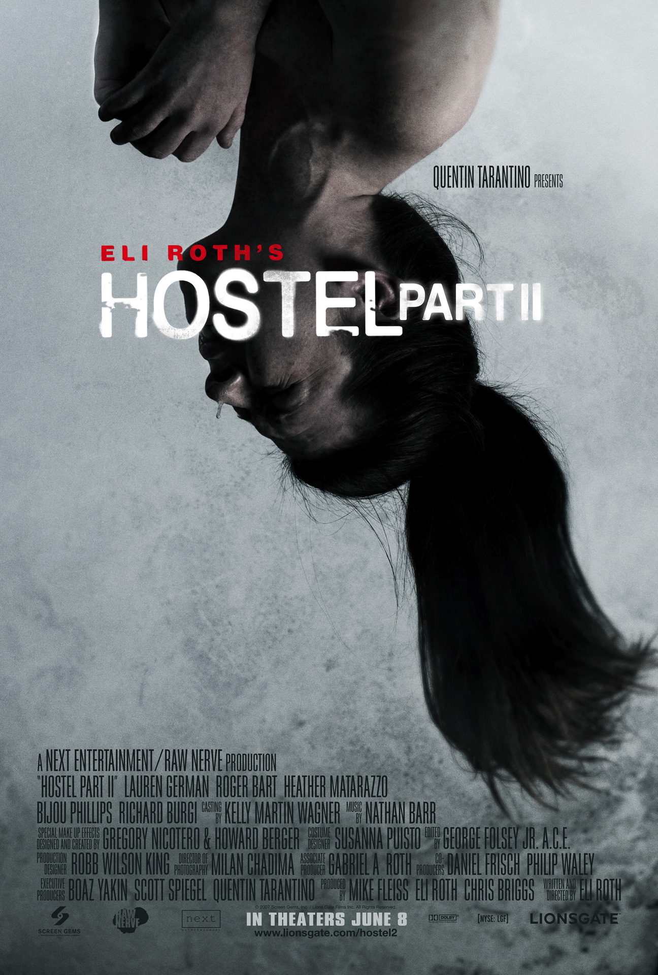
HOSTEL - Part2
The target audience for the 'Hostel' poster is males aged between 12-25 because it falls under the horror genre. The theorist who would most likely be reinforced here would be Stanley Hall with his 'Storm
and Stress Model' (1904) who stated: “Youth aged between 12 an 24 are involved with crime, mood depression and sex.” I will be analysing the the poster to see if it follows the common conventions of the horror genre.
Image
The poster follows the common conventions in terms of the image that has been used. Usually in horror genres the poster usually only have one select image to attract the audience and clearly represent the narrative. Blumer and
Katz theory of entertainment and diversion can be reinforced here has the audience will seem very curious and interested in the meaning behind the image. It seems to be a young woman bounded up and hanging from her feet. She seems very distressed as if shes the victim, this will entice the audience to find out the narrative of 'Hostel part2'. Also Laura Mulvey's theory that woman are seen as 'objects of sexual desire' as she appears to be naked and this would appeal to a male target audience more so than a female.
Typography
In terms of typography the poster follows the common conventions as the release date is present and the production companies that help distribute the film are involved too. At the bottom of the poster the text isnt very clear for the audience to read, however if they were up close to the poster. Although this text isnt very important but is something required on posters as conventions to show the audience if they wanted to see who was involved in the production of the film. Although due to the minimalistic typography it makes the poster very simplistic which will appeal to the target audience so it doesnt need to much text.
Colours
The colours involved with the poster are very saturated like the vibrancy has gone and to me this symbolises that the life has been drained from the image which gives it that eerie look of danger and potential fear. The colours are greys and saturated light blues as these colours represent negativity which connotes that something bad is bound to happen in the film. These colours represent the horror genre very well, although conventional colours for horros are reds and black which this poster doesn't include. However these colours are still conventional as it is clearly representing the horror genre.
Layout
The layout of the poster is different from other horror posters I have analysed as the text goes up the poster rather than sticking to the middle bottom of the poster. However this effect works very well and even though it isnt entirely conventional. The only thing this poster is missing is the tag line as most poster of all genres include this important convention as it entices the audience.
DRAG ME TO HELL
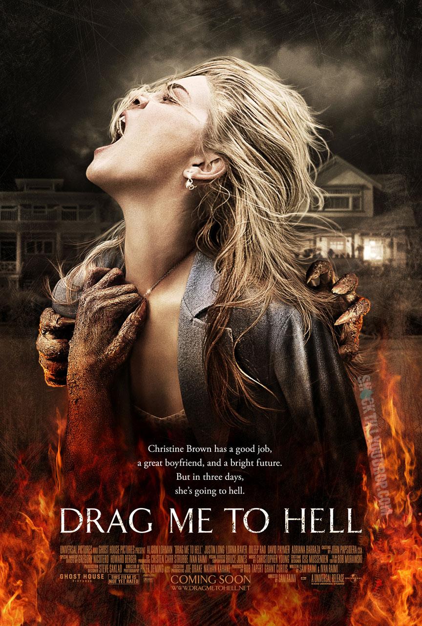 The target audience again is males aged from 12-25 because it is a horror genre. Although this could also appeal to a female target audience because of the use of colours and features in the poster.
Image
The poster again follows the common conventions that apply with images. Blumer and Katz theory of entertainment and diversioncan be applied here as the target audience will be curious and interested in why 'she' is going to hell. The image follows the conventions by using just the one image and in the image she is screaming as she is being dragged to 'Hell' by an unknown creature that is left to the imagination. Laura Mulvey could potentially be applied here with her theory of the 'male gaze' as the star vehicle in the image is a visually attractive woman and would attract a male audience more than a female.
Typography & Lexis
To create a reaction from the audience who views the poster, the creators have used "Christine Brown has a good job, a great boyfriend and a bright furture. But in three days, she going to hell." This begins very positivly and then quickly turns negative which will entice and interest the audience as the viewer will want to know why this is happening. Blumer and Katz theory can apply here again as the audience can see by the poster saying 'coming soon' allows the audience to see that the film will be out within that time period.
Colours
The colours used are fairly conventional as the red/orange fire is a typical convention of horror poster, this colour also helps connote anger and danger. These colour represent horror very well and are very common colours used within this genre. This iconography can help create tension from the audience as it could be reflecting emotions towards the target audience.
Different selection of horror poster-
These posters all show the common conventions used in horror posters, however it shows how they can all be different yet follow the majority of these conventions.


Layout
The layout of the poster is different from other horror posters I have analysed as the text goes up the poster rather than sticking to the middle bottom of the poster. However this effect works very well and even though it isnt entirely conventional. The only thing this poster is missing is the tag line as most poster of all genres include this important convention as it entices the audience.
DRAG ME TO HELL
Image
The poster again follows the common conventions that apply with images. Blumer and Katz theory of entertainment and diversioncan be applied here as the target audience will be curious and interested in why 'she' is going to hell. The image follows the conventions by using just the one image and in the image she is screaming as she is being dragged to 'Hell' by an unknown creature that is left to the imagination. Laura Mulvey could potentially be applied here with her theory of the 'male gaze' as the star vehicle in the image is a visually attractive woman and would attract a male audience more than a female.
Typography & Lexis
To create a reaction from the audience who views the poster, the creators have used "Christine Brown has a good job, a great boyfriend and a bright furture. But in three days, she going to hell." This begins very positivly and then quickly turns negative which will entice and interest the audience as the viewer will want to know why this is happening. Blumer and Katz theory can apply here again as the audience can see by the poster saying 'coming soon' allows the audience to see that the film will be out within that time period.
Colours
The colours used are fairly conventional as the red/orange fire is a typical convention of horror poster, this colour also helps connote anger and danger. These colour represent horror very well and are very common colours used within this genre. This iconography can help create tension from the audience as it could be reflecting emotions towards the target audience.
Different selection of horror poster-
These posters all show the common conventions used in horror posters, however it shows how they can all be different yet follow the majority of these conventions.

Research and analysis into other genres (posters)
There is no main pieces of text and typography but the main part of the poster is the name of the film (I.e. the title) this is the biggest piece of text on the poster and is designed in this way to draw the audiences attention to the name of the film. Also another piece of text used to stand out to the audience is at the very top of the poster where it is deserted by any other pieces of text. “ Life is the most spectacular show on earth ” this is what is said. It is in capital letters and the font is a sort of Arial type. This stands out to the audience as it is the only piece of text located on its own and is the second largest text on the poster.
Another part of the poster that intentionally stands out is the date in which the film is being distributed to the public. The names of the star vehicles that are largely involved in the film are located above the title as the audiences attention is immediately drawn to the title and the names are right above the title which will result in the audience seeing the main cast of the film. Also the colour difference attracts the audience which is another advantage for the poster.
Unlike the other posters analysed this poster has less natural colours on the poster. In the foreground there are two characters in each others arms and could potentially symbolise the different classes? The colour of the clothing worn is very old fashioned colours like creams, bays , browns and navy blues. The foreground is quite busy as there are the couple in the middle, an elephant on the left and the woman’s ex-lover on the right standing in an old circus train. There are many colours which helps represent the chaos and wonders of the circus which the film is based around. The colours suit the storyline of the film. However the chaotic colour scheme really works perfectly in place and looks very good. The poster is very well constructed to appeal to the target audience.
P.S. I love you
Initially there is not much text or typography. There are some different forms of font and there are four visually different fonts. The main part of the poster is the title and name of the film. ‘P.S. I love you’ this looks as if it is hand written in (the type of font) which helps the audience to highlight the content of the film. The two main characters have been made to stand out to the audience as it has been enlarged more than the other text. As the genre of the film is Drama/ Romance, the text is very important in order to attract the audience. Below the name of the film which stands out the most, there is a sentence which draws the attention of the audience with “Sometimes there‘s only one thing left to say…” also “P.S. Love you”. These both draw the audience to discover that the film is about romance and this appeals to more of a female audience. By highlight the part of text, the poster could be trying to symbolise that that is the only work left to say and is the simplest thing that can be said.
The main foreground is of a couple, the poster is very simple and the colours are very saturated and neutral. The woman is in front of the man which could suggest that she is the main character, whereas the man is behind her and could suggest he is not the dominant character. This could also help represent the tragic love story between two people, and how simply things can change. The background is plain white which detracts attention from the image. There are also letters at the bottom of the poster where your eyes are draw to the title and then the recognition of the letters in the foreground.
This again helps identify the key features of the film and what it entails. The main colours are very natural and are:
Skin pink
Red
Light Blue
White
Black
These are the main colours within the poster. It is quite a bright poster and as the man dies within the film the lightness of the poster could symbolise heaven?
Theorists?
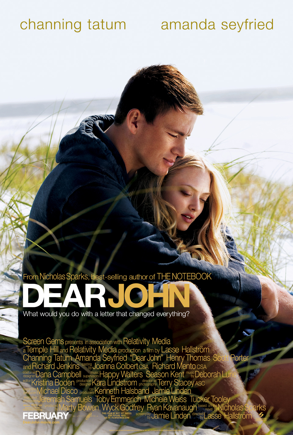
Dear John
There is no main typography that is very important, however the title/name of the film dominates the size of the text and draws the audiences attention to that piece of text. Visually there looks to be two different fonts used within the poster and the lower part of the poster seems to have the same type of font style and the top of the poster has a different font to allow the audience to see the two main characters/ star vehicles. The title is in capitals and is the largest piece of text on the poster. This allows the audience to see what the film is. Again this is another film which focuses on letters as the genre of the film is again a drama, romance. Another part of the poster that intentionally stands out is the date in which the film is being distributed to the public.
The colour of the font is again quite natural and in the foreground there is an image of a couple sat on the beach. The beach is a very natural setting and it is another natural image. Like the previous poster, the colours are again very neutral, however this image has more colour. These colours involve:
Light and Dark blue
Yellow
White
Orange and green
These are the colours that stand out the most.
Around the title there are two sentences surrounding it. Above the title the poster highlights that it was produced by the same author of ‘The Notebook’ and make sure they show it was a ‘best seller’ . “What would you do with a letter that changed everything” this was what was shown below the title. This is a rhetorical question to the audience and this involved the audience to imagine what it would be like in that situation and engages the audience. Also if the audience is not aware of the storyline, it could come across positive or negative.
Subscribe to:
Comments (Atom)