There is no main pieces of text and typography but the main part of the poster is the name of the film (I.e. the title) this is the biggest piece of text on the poster and is designed in this way to draw the audiences attention to the name of the film. Also another piece of text used to stand out to the audience is at the very top of the poster where it is deserted by any other pieces of text. “ Life is the most spectacular show on earth ” this is what is said. It is in capital letters and the font is a sort of Arial type. This stands out to the audience as it is the only piece of text located on its own and is the second largest text on the poster.
Another part of the poster that intentionally stands out is the date in which the film is being distributed to the public. The names of the star vehicles that are largely involved in the film are located above the title as the audiences attention is immediately drawn to the title and the names are right above the title which will result in the audience seeing the main cast of the film. Also the colour difference attracts the audience which is another advantage for the poster.
Unlike the other posters analysed this poster has less natural colours on the poster. In the foreground there are two characters in each others arms and could potentially symbolise the different classes? The colour of the clothing worn is very old fashioned colours like creams, bays , browns and navy blues. The foreground is quite busy as there are the couple in the middle, an elephant on the left and the woman’s ex-lover on the right standing in an old circus train. There are many colours which helps represent the chaos and wonders of the circus which the film is based around. The colours suit the storyline of the film. However the chaotic colour scheme really works perfectly in place and looks very good. The poster is very well constructed to appeal to the target audience.
P.S. I love you
Initially there is not much text or typography. There are some different forms of font and there are four visually different fonts. The main part of the poster is the title and name of the film. ‘P.S. I love you’ this looks as if it is hand written in (the type of font) which helps the audience to highlight the content of the film. The two main characters have been made to stand out to the audience as it has been enlarged more than the other text. As the genre of the film is Drama/ Romance, the text is very important in order to attract the audience. Below the name of the film which stands out the most, there is a sentence which draws the attention of the audience with “Sometimes there‘s only one thing left to say…” also “P.S. Love you”. These both draw the audience to discover that the film is about romance and this appeals to more of a female audience. By highlight the part of text, the poster could be trying to symbolise that that is the only work left to say and is the simplest thing that can be said.
The main foreground is of a couple, the poster is very simple and the colours are very saturated and neutral. The woman is in front of the man which could suggest that she is the main character, whereas the man is behind her and could suggest he is not the dominant character. This could also help represent the tragic love story between two people, and how simply things can change. The background is plain white which detracts attention from the image. There are also letters at the bottom of the poster where your eyes are draw to the title and then the recognition of the letters in the foreground.
This again helps identify the key features of the film and what it entails. The main colours are very natural and are:
Skin pink
Red
Light Blue
White
Black
These are the main colours within the poster. It is quite a bright poster and as the man dies within the film the lightness of the poster could symbolise heaven?
Theorists?
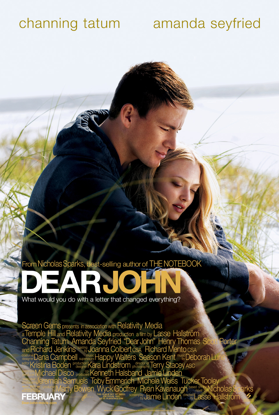
Dear John
There is no main typography that is very important, however the title/name of the film dominates the size of the text and draws the audiences attention to that piece of text. Visually there looks to be two different fonts used within the poster and the lower part of the poster seems to have the same type of font style and the top of the poster has a different font to allow the audience to see the two main characters/ star vehicles. The title is in capitals and is the largest piece of text on the poster. This allows the audience to see what the film is. Again this is another film which focuses on letters as the genre of the film is again a drama, romance. Another part of the poster that intentionally stands out is the date in which the film is being distributed to the public.
The colour of the font is again quite natural and in the foreground there is an image of a couple sat on the beach. The beach is a very natural setting and it is another natural image. Like the previous poster, the colours are again very neutral, however this image has more colour. These colours involve:
Light and Dark blue
Yellow
White
Orange and green
These are the colours that stand out the most.
Around the title there are two sentences surrounding it. Above the title the poster highlights that it was produced by the same author of ‘The Notebook’ and make sure they show it was a ‘best seller’ . “What would you do with a letter that changed everything” this was what was shown below the title. This is a rhetorical question to the audience and this involved the audience to imagine what it would be like in that situation and engages the audience. Also if the audience is not aware of the storyline, it could come across positive or negative.
No comments:
Post a Comment